Friday, September 10, 2010

35 Beautiful Photography Websites. Click on pictures to open!

35 Beautiful Photography Websites


Interest in photography has exploded over the last 10 years, largely thanks to the developments in digital photography. Cameras and computers have become cheaper and more powerful, software more sophistocated and printers can now print photos that are as good (if not better) than anything produced in a chemical darkroom. Now, once you’ve acquired a digital setup, the economic restrictions of film and development costs have been removed and the cost of photography is virtually nil.
Along with these developments in photography has been the parallel development of the Web. Ten years ago websites were largely clumsy, HTML driven constructions. Today, contemporary photographers have powerful tools such as Flash, WordPress and DreamWeaverwith which to develop their websites. Photographers can also sell their work through companies such as PhotoShelter or ImageKind, and through photo libraries such as Alamy and iStockPhoto, opening up new revenue streams.
The result is that photographers are finding new and exciting ways to showcase their best work online. We took a look at some of the beautiful photography websites that we could find, analyzing the design trends and the reasons why these websites work.
You may want to take a look at the following related posts:

Beautiful Photography Websites

Bottle Bell Photography
The graphic design of this website perfectly complements the fantasy world of the photographer’s vision.
Pw36 in 35 Beautiful Photography Websites
Daniel Kennedy Photography
Top class professional photography presented in a simple to navigate, beautiful website.
Pw37 in 35 Beautiful Photography Websites
East Photographic
An unusual site because it belongs to an agency rather than a single photographer.
Pw39 in 35 Beautiful Photography Websites
Jason Bell
The website of world renown celebrity photographer Jason Bell. Yes, that’s Mickey Rourke on the front page.
Pw40 in 35 Beautiful Photography Websites
Jeffery Salter
Simple and effective design.
Pw41 in 35 Beautiful Photography Websites
Jill Greenberg
A beautiful website from a master photographer. The photos are big, bold and colourful.
Pw42 in 35 Beautiful Photography Websites
Jonathan Glynn Smith
A dramatic splash screen and beautifully minimalist design.
Pw43 in 35 Beautiful Photography Websites
Kim Mendoza
This website shows off the work of social photographer Kim Mendoza. The music is a nice touch, what visitor fail to be convinced of this photographer’s talent?
Pw44 in 35 Beautiful Photography Websites
Levon Biss
All the drama and explosive action of sports photography.
Pw45 in 35 Beautiful Photography Websites
Rankin
A bold and colourful design from one of the UK’s foremost fashion and editorial photographers.
Pw47 in 35 Beautiful Photography Websites
Steve McCurry
The warm colours of this website are unusual, and make the website stand out.
Pw48 in 35 Beautiful Photography Websites
Timothy Hogan
This website expands to a full screen to show off the photographer’s photos.
Pw50 in 35 Beautiful Photography Websites
Lara Jade
A beautifully designed flash based website.
Pw1 in 35 Beautiful Photography Websites
Brent Stirton
Photojournalist Brent Stirton’s website grabs you on the first page with a fast moving slideshow of some his most dramatic and hard hitting images.
Pw3 in 35 Beautiful Photography Websites
Burn Magazine
Burn magazine uses a blog-like design to keep the lastest content fresh on the page. It uses a dark gray background to emphasise the site’s logo, displayed prominantly at the top, and a large photo to introduce the lead story.
Pw4 in 35 Beautiful Photography Websites
Gavin Gough
Gavin Gough is a travel photographer currently living in Thailand. His website is a brilliant example of self-promotion. The front page has a small flash movie at the top and a large photo underneath. Dig deeper into the website and there are photo galleries showing only his best work, a blog for personal anecdotes and tutorials, and a stock photo gallery hosted by PhotoShelter.
Pw6 in 35 Beautiful Photography Websites
Timothy Allen
Timothy Allen’s website is a WordPress powered blog, slightly corporate in nature as it’s put together in conjunction with the BBC. The design is very effective, there is a fast moving slideshow at the top of the front page, and below that, a moving strip of thumbnails that are links to the latest articles. The latest article is published underneath, and at the bottom five short columns display links to articles on Photography, Travel, Video, Tutorials and My Musings. The front page is designed to wow the visitor and provide easy to follow links to all the interesting content within the website.
Pw9 in 35 Beautiful Photography Websites
Mitchell Kanashkevich
A beautiful website, the reader is in no doubt that the website belongs to a travel photographer. Navigation is clear and simple and the photo galleries are stunning. The photographer has a small collection of his best photos. This is very important, because the quality of a portfolio is often judged by the weakest shot.
Pw11 in 35 Beautiful Photography Websites
Bruce Percy
A very simple design that leaves the viewer no doubt what he’s seeing. A quick glance is enough to see what the photographer does. Navigation again clear and simple. The black background works well with the minimalist design.
Pw12 in 35 Beautiful Photography Websites
Face On Images
Photographer Les Forrester’s website is a masterpiece of simple design. The colour scheme of dark grays and blacks, with typography in gray, white and red is very effective. A moving slide show shows off some of his best photos on the front page, along with a nice introduction and the latest news.
Pw14 in 35 Beautiful Photography Websites
Your Beautiful Photography
Once you get past the splash page the simplicity and beauty of this website becomes apparent. The photos dominate, presented against a simple white background.
Pw16 in 35 Beautiful Photography Websites
Pablo Corral Vega
Pablo Corral Vega is an established, well known photojournalist and his website reflects the quality of his work. Note the simplicity of the opening page design, a stunning photo at the top, the photographer’s name above, and more links below.
Pw19 in 35 Beautiful Photography Websites
Colin Prior
Simple design from Colin Prior, a British landscape photographer. A simple to navigate menu bar, an abstract photo that makes the perfect backdrop for some text, and below some inviting images that draw the visitor into the different parts of the website.
Pw20 in 35 Beautiful Photography Websites
Mark Velasquez
Mark Velasquez’s website features imaginative, colourful photography, presented in a series of easy to navigate photo galleries. One reason I like the photo gallery layout because it’s easy to navigate, the photos are relatively small and quick to load, and the photos are presented against a neutral gray background.
Pw21 in 35 Beautiful Photography Websites
Jeremy Cowart
Sometimes, a pro photographer just needs a fantastic looking website that displays photos and little else. SEO and speed aren’t priorities, because the url will be given to potential clients. The important thing is to wow the viewer. That’s what Jeremy Cowart’s website does.
Pw22 in 35 Beautiful Photography Websites
Paolo Boccardi
A big photo on the front page, easy to navigate links (I really like the little windows that pop up when you mouseover the links) and then horizontal photo galleries. Lovely!
Pw24 in 35 Beautiful Photography Websites
Anna Kuperberg Photography
A beautiful flash driven website. Excellent photography, a front page slideshow to show off the work, and a music soundtrack that seduces the viewer. A very professional design.
Pw26 in 35 Beautiful Photography Websites
Vincent Laforet
Open with a bang! Vincent Laforet’s website opens with his video Reverie, a video which created so much excitement amongst the photography world that it was downloaded over 1.5 million times the first 10 days it was online.
Pw27 in 35 Beautiful Photography Websites
Chase Jarvis
Chase Jarvis is famous amongst photographers for his blog, but his website is a masterpiece of web design. The viewer is greeted by a large, dramatic, slideshow on the front page, and an easy to navigate menu. The portfolio pages are spectacular, and the flash based design looks great.
Pw28 in 35 Beautiful Photography Websites
Stefan Soell
Another horizontal photo gallery, this one is interesting because the gallery is contained within a frame. Frames are a little outdated, but the advantage here is that the viewer can switch between portfolios without leaving the front page. The photographer sells fine art prints and books through the site, and the viewer is left in no doubt that he’s an expert in his craft.
Pw29 in 35 Beautiful Photography Websites
Amy Deputy Photography
Another flash based website, beautiful in its simplicity. The front page consists of four simple square images, link text and the photographer’s name and logo. The soft pastel colours of the photos on the front page complement each other. The website is also supported with a blog. Note the high quality of the portfolios. The website makes it clear that the photographer operates at the high end of the market.
Pw30 in 35 Beautiful Photography Websites
Jessica Hilltout
Fine art photographer Jessica Hilltout’s website has a very nicely designed front page, organising her work into three themes. Her name’s displayed along the top, and the categories along the bottom. A very simple, but effective website.
Pw31 in 35 Beautiful Photography Websites
Chris Phelps
A bold, graphic image on the front page, complemented by a simple navigation and design. A very effective portfolio presentation. All supported by a blog. Nice, very nice.
Pw32 in 35 Beautiful Photography Websites
Isabelle Ribeiro Photography
There’s a lot to like about this website; a strong, simple front page slideshow, beautifully presented photo galleries, and a blog!
Pw33 in 35 Beautiful Photography Websites
John Wright
Fashion photographer John Wright’s front page is a masterpiece of minimalist design. Not having a photo on the front page is a very bold move. Like many pro photographers, download speed is sacrificed for effect with a flash based website.
The moving thumbnails on the portfolio pages are a wonderful touch.
Pw34 in 35 Beautiful Photography Websites

Last Click

Andrew F Photography
Another masterpiece of Flash web design from a pro photographer. The opening photos are stunning, and I love the way they float up and down. The photo galleries are a joy to navigate and view.
Pw35 in 35 Beautiful Photography Websites

Trends In Photography Websites

Blogs
The best are entertaining and informative, establishing the photographer’s expertise and building a relationship of trust and credibility with potential clients.
Teaching
Photographers are passing on their knowledge and experience to beginners and enthusiasts.
Selling
Photographers are promoting themselves and their work. Some stock photographers sell their photos through their websites rather than the big agencies.
Workshops
Many established photographers earn money by teaching, and promote their workshops on their websites.
Social networking
Many photographers have a page on Facebook, or a Flickr or Twitter account.
Flash
Flash-based websites can be beautiful and effective, freeing the web designer from the limitations of HTML and CSS. The downside is that they’re expensive to create, can take time to download and aren’t good for SEO. Often used by pro photographers who will send their url to interested parties and need a spectacular showcase for their images.
HUGE photos
Photography websites are naturally dominated by images. A recent trend is to display large photos for maximum impact.
Sophisticated design
Photographers are visual artists and need the design of their websites to reflect this. Good design often works in the background by making websites quick to load, easy to navigate and search engine friendly.
Content over design
No matter how good the design, content is king. It may look pretty, but if it doesn’t inform and entertain, your visitors won’t return. Some of the most popular photography websites are nothing more than a free Blogger blog.

Friday, August 27, 2010

Yosemite's Fire Waterfall, Thanks Ray!

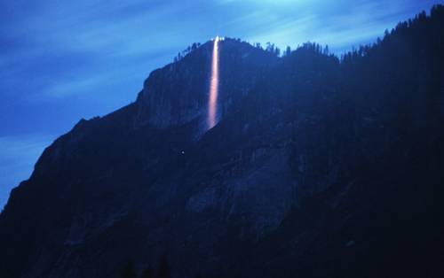
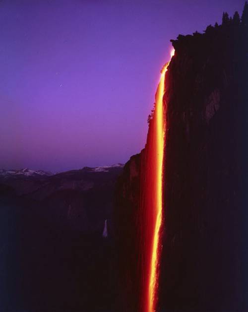
Yosemite's Fire Waterfall

A rare sight!! Yosemite National Park, California, USA
This park was gazetted as a national park in 1890. It is world famous for its rugged terrain, waterfall and century-old pine trees. It covers 1200 sq km and the "fire" waterfall of El Capitan is one of the most spectacular of all scenery.
The spectacular view of the waterfall is created by the reflection of sunlight hitting the falling water at a specific angle. This rare sight can only be seen at 2-week period towards the end of Feburary. To photograph this rare event, photographers would often have to wait and endure years of patience in order to capture them. The reason is because its appearance depend on a few natural phenomena occurring at the same time and luck.
1st, Is the formation of the waterfall - The water is formed by the melting of snow and ice at the top of the mountain. It melts between the month of December and January and by the end of February there might not have much snow left to melt.
2nd, is the specific angle of the sunray hitting the falling water - The sun's position must be exactly at a particular spot in the sky. This occurs only in the month of February and at the short hours of dusk. If it is a day full of clouds or something blocking the sun, you can only take pictures of your own sorry faces on the waterfall. It coincides with the fact that the weather in the National Park at that time of the year is often volatile and unpredictable. It compounds the difficulty of getting these pictures.
Someone did !!! and we all get to see it !!!


Lavafall at Yosemite


February firefall of Yosemite National Park


Lavafall at Yosemite National Park


Lava fall at Yosemite National Park


Yosemite firefall
Yosemite firefall


Yosemite fire waterfall


Yosemite lava fall
Yosemite lava fall


Yosemite National Park Lavafall


Yosemite waterfall on fire, at dusk


Rainbow with a waterfall at Yosemite National Park


https://blogger.googleusercontent.com/img/b/R29vZ2xl/AVvXsEgK_5qnymPW-5JZyazB8CTlhzxDQ5v63RrDHlblZ34D_REniR6WjDlj4IwQA4EgTg9mWW0g_mjADyJmX6HYpRIe3sXdnDIKjUhXZtnRPPmo44cpzDfUX6X7H-com_EXzO65R42iIOidJy0/s1600/ATT00022.jpg


 https://blogger.googleusercontent.com/img/b/R29vZ2xl/AVvXsEiuPYkRBzCjx4A2nbJIEOKD-00Ucm_A5WOz36lJCiJRmUOinFcT2LQ0UZKbVAikRsyo6VYibGDIbdohpTvgGPkJHDyxDcDramiuNk2dvPDaDHOnkDSqIVa8S1jgQJwE48z3lZ6SoOAEo24/s1600/ATT00013.jpg


https://blogger.googleusercontent.com/img/b/R29vZ2xl/AVvXsEhaGwDArQy9drBvXvvMwuD-vfi2m8uBsL0SAnVMavytvdpOTebQwk6zzpWHlnB0rP6wFQFQqEp8aFPsp2pTj-FgoQC8QXAgS20xysJj61-hL6xHYs-D9dC-z1FV6xSnBQ0j_aEnq2iIodI/s1600/ATT00016.jpghttps://blogger.googleusercontent.com/img/b/R29vZ2xl/AVvXsEiVmzuH-TN5beqGYbllR17Ry4vQJRUJY1-31MvTQaVAtrBK37ZmFvN0ck_E8VOqPmzCsm5nuUASajaHZcftH-bar4LkDJqZFQkGUQB0riDMYHEJLCMt4DOktXry96kQH9e50c1e_dp_iYk/s1600/ATT00010.jpg


 https://blogger.googleusercontent.com/img/b/R29vZ2xl/AVvXsEiAi9bgDx8km2RQATz45HvyTRHw4S08YpoYRG1Ae7VhxpjB19jMdsFecglZpcgmmK3gzc3JrLZyUYnLq0VIawjAsJhR053h41zxeCkVMIsIkNMQ-LGXYBcnT1rwXBl70O11Qmj3LUlAdKQ/s1600/ATT00031.jpg

Wednesday, August 18, 2010

Examples of Color Macro Shots of Fruit and Flowers

Examples of Color Macro Shots of Fruit and Flowers

Detail shooting of flowers and fruit can bring beautiful, high saturation color and intricate textures. This kind of shooting is best shot with a good zoom lens so you do not blur the photo with standing incredibly close to the subject matter. It is also helps to turn on the manual zoom so you can focus on the particular detail in the flower that you want to show.

Pink Flower
©Elizabeth Anderson, 2010 www.design-flip.com
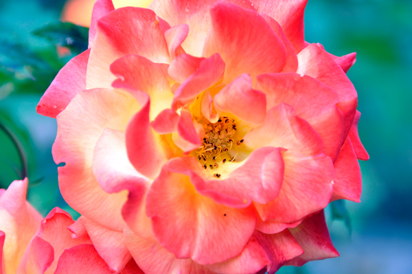
Pink Rose
©Elizabeth Anderson, 2010 www.design-flip.com
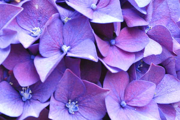
Purple Hydrangea
©Elizabeth Anderson, 2010 www.design-flip.com
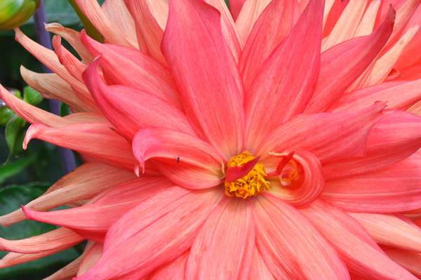
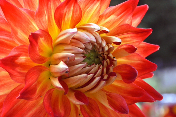
Dahlia
©Elizabeth Anderson, 2010 www.design-flip.com
Shooting on a medium light day also greatly helps the vibrancy and illumination of the petals. High light can cause blowout and overexposure of the image which will wipe out all the intense details. Low light will cause color distortion and inaccuracy. It will be important as well to adjust your ISO setting, if you can, up and down per shot as you need to depending on the direction the flowers are facing. Also, light meter carefully to bring out the richness of the color without having to do a lot of post work on the computer.
Magenta Flowers
©Elizabeth Anderson, 2010 www.design-flip.com
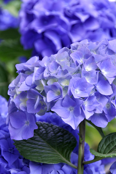
Bunch Hydrangea
©Elizabeth Anderson, 2010 www.design-flip.com
Also, consider the form and shape of each group of flowers you are shooting. The contours of the edges may be the most interesting so you could show the flower from the profile side. Or, the texture and softness of the flower may be best shown in intense, zoomed in detail. Or, perhaps show the grouping of tiny flowers by not zooming in too much and allowing space to show the bending of the stems as well. Perfection is not always the goal in shooting this kind of subject matter. Each flower has its own personality. Try to bring out their character by embracing their imperfections as well as their color. The background, if left simple, can also be used to bring out their intricacies.
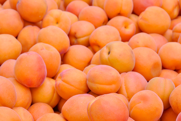
Apricots
©Elizabeth Anderson, 2010 www.design-flip.com
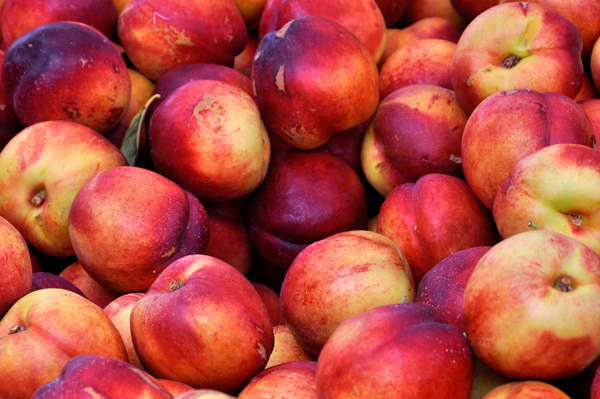
Nectarines
©Elizabeth Anderson, 2010 www.design-flip.com
Photographing fruit is a similar situation to shooting flowers. They often have amazing color and their abundance in a group are fascinating to capture. Their textures and shape are interesting and through proper exposure, their high saturation color can also be shown in all their vibrancy.
Peaches
©Elizabeth Anderson, 2010 www.design-flip.com
Green Apples
©Elizabeth Anderson, 2010 www.design-flip.com
These were shot at an outside farmer’s market which is ideal lighting. Bunches of fruit can also be shot at a grocery store, but often, the fluorescent lights can make the colors inaccurate and dull. You may need to shoot different fruits at different times of year, depending on when they are in season and at peak ripeness and color. This will depend a lot on where you live and what is available. Keeping the exposure accurate is also important to keep the roundness of their shapes. Over exposing the image can take away the edges and blend each piece together.
Remember to experiment with each image to capture the subjects at their maximum color. You may want to bracket in case the lighting changes or the color is not 100% accurate.

Saturday, July 3, 2010

Art in sewing

my shop.


I make these plushies for fun, not to make money. But, I’m also excited about making one of a kind pieces that are affordable to people who want to collect my art. Each piece is about 11.5″ x 4″  and handmade with love and sweetness!
I was totally craving ice cream while working on these. :)

Design , amazing!

http://www.youtube.com/watch?v=Lg9qnWg9kak&feature=player_embedded


  1. A tiny apartment with 24 rooms

    By Matt Hickman, 

    Gary Chang takes compact living to the extreme with his 330-square-foot Hong Kong apartment that squeezes in over 24 different room configurations. Read full post »


    Hong Kong ”Domestic Transformer" Architect Gary Chang


    24 Rooms Tucked Into One

    It looks like open space, but behind movable walls, this tiny apartment holds surprises.


    A floor plan of the dining area. 
    GARY CHANG stood in the middle of his apartment on a recent Saturday morning, ignoring a message from his Nintendo Wii on the wall-size screen: “Are you fidgeting? I can’t seem to analyze you.” He repositioned the game system’s balance board, stepped on for a second run of downhill skiing and began to shift from side to side, a computer-generated figure swishing in time with him across the room.
    Soon enough, having worked up an appetite, he was ready to move on. He used a remote control to raise the screen, revealing a large yellow-tinted window behind it, filling the room with radiance. “Like sunshine,” Mr. Chang said, though the colorized gray daylight made the view — a forest of apartment towers in Hong Kong’s bustling working-class Sai Wan Ho district — look dusky, like an old sepia print.
    He grabbed a handle near the wall-mounted television, pulling a section of the wall itself toward the center of the room. Behind it, a small countertop with two burners, a sink and a spice rack appeared. Opposite the countertop, on the back of the now-displaced wall, he lowered a hinged worktop made of a lightweight laminate of honeycombed aluminum. Suddenly, he was standing in a kitchen.
    This room — the “maximum kitchen,” he calls it — and the “video game room” he was sitting in minutes before are just 2 of at least 24 different layouts that Mr. Chang, an architect, can impose on his 344-square-foot apartment, which he renovated last year. What appears to be an open-plan studio actually contains many rooms, because of sliding wall units, fold-down tables and chairs, and the habitual kinesis of a resident in a small space. As Mr. Chang put it, “I glide around.”
    Mr. Chang, 46, has lived in this seventh-floor apartment since he was 14, when he moved in with his parents and three younger sisters; they rented it from a woman who owned so much property that she often forgot to collect payment.
    Like most of the 370 units in the 17-story building, which dates to the 1960s, the small space was partitioned into several tiny rooms — in this case, three bedrooms, a kitchen, a bathroom and a hallway. Mr. Chang’s parents shared the master bedroom (though when they first moved in, his father lived in the United States, where he worked as a waiter at Chinese restaurants in various cities). His sisters shared a second bedroom, and the third, almost incredibly — although not unusually for Hong Kong — was occupied by a tenant, a woman in her 20s, whom Mr. Chang remembers only for the space she took up.Mr. Chang slept in the hallway, on a sofa bed.
    These days, he uses a hydraulic Murphy bed of his own design, hidden behind a sofa during the day. “That old routine of folding out the bed is similar in spirit to what I do today,” he said. “But the reasons are different. Then, it was just necessary. Now, it’s all about transformation, flexibility and maximizing space.”
    MR. CHANG’S experiment in flexible living began in 1988, when his family moved into a bigger apartment a few blocks away, with his grandparents and uncles.
    Mr. Chang was then working for the P&T Group, an architectural firm, and living in a rented room near the University of Hong Kong, where he had studied architecture. His mother suggested that he take over the lease on their old apartment, “because the rent was unusually low,” he said. Instead he bought it, for about $45,000.
    He had been itching to tear down the walls since his teenage years, when he sketched new designs for the family home, and he then began in earnest. In the last two decades, he has renovated four times, on progressively bigger budgets as his company, Edge Design Institute, has grown. His latest effort, which took a year and cost just over $218,000, he calls the “Domestic Transformer.” The allusion to toy robots seems apt, given the science-fiction quality of the color scheme — mostly black and silver, washed in eerie yellow light.
    But if the apartment is a space for play, it’s very much the grown-up kind, involving the pleasures of luxury: Behind one movable wall of shelving is an extra-large Duravit bathtub. A glass shower stall doubles as a steam room with color therapy and massage. The Toto toilet has a heated seat and remote control bidet, and sound emanates from a six-speaker home entertainment system.

    A floor plan of the home spa. 

    A floor plan of the kitchen. 

    A floor plan of the bedroom area.
    Moving partitions and opening cabinet doors reveals stacks of carefully chosen objects: Alessi dishes and Arne Jacobsen cutlery; what Mr. Chang calls an “altar of Muji accessories,” including travel bottles and neatly packaged tissues; and several thousand CDs filling an entire wall. (Mr. Chang, a technophile who checks on his apartment with a Web cam while traveling, refuses to switch to MP3 files because he loves CD cases and liners.)
    The need for space to accommodate these collections was what drove his latest renovation.
    In 1998, as part of his third renovation, which he called “Flexible Curtains,” Mr. Chang had remade the apartment as a single open room, in pale hues, with shelves concealed behind curtains. But his collections had grown too large to be contained by the shelving, and piles of objects had begun to colonize the glossy white-painted floor.
    It is a familiar predicament in Hong Kong, one explored in “Domestica Invisible,” a 2006 exhibition at the city’s Goethe-Institut of Leung Chi-Wo’s photographs of clutter in cramped apartments. A curator described the condition as “a fundamental aspect of the city’s spirit,” and wrote, “there is no longer the capacity to enjoy open space, nor the room for imagining alternative lives.”
    Mr. Chang hopes that some of his home’s innovations might be replicated to help improve domestic life in Hong Kong, which has been troubled in recent years. The population grew by nearly a half-million in just the last 10 years, and between 2003 and 2007, reports of new cases of child, spousal and elder abuse nearly doubled, something social workers attribute in part to new social pressures caused by the city’s ongoing shortage of space.
    “It’s a big problem,” Mr. Chang said. “Killing each other is not uncommon.”
    “People feel trapped,” he said. “We have to find ways to live together in very small spaces.”
    In Mr. Chang’s solution, a kind of human-size briefcase, everything can be folded away so that the space feels expansive, like a yoga studio.
    The wall units, which are suspended from steel tracks bolted into the ceiling, seem to float an inch above the reflective black granite floor. As they are shifted around, the apartment becomes all manner of spaces — kitchen, library, laundry room, dressing room, a lounge with a hammock, an enclosed dining area and a wet bar.
    One can imagine three, possibly four people living here, using Mr. Chang’s double bed and the guest bed that hovers over the bathtub — though six or seven, the number of residents when Mr. Chang was growing up, would be another matter.
    Acoustic privacy is limited. When Mr. Chang is entertaining, anyone who wants to use the phone must do so in the shower (also known as “the phone booth”).
    Still, Mr. Chang is determined to see his ideas put to use in new multi-unit buildings. He has invited a number of developers to visit, and has meticulously documented his apartment’s history in a book, “My 32m2 Apartment: A 30-Year Transformation” (MCCM Creations, 2008).
    Buying a new apartment might have been a less expensive solution to his storage problem, he admitted. “But why do that?” he asked as he stood in the kitchen making noodle soup. “I see my place as an ongoing experiment.”
    Reposted from http://www.nytimes.com and http://www.smartplanet.com/